
Choosing colors for knitting (or any fiber art) can be daunting. It can tank a project or make it sing, but it can be hard to know which one of those things will happen until you start knitting sometimes. I get it! And though you probably can’t tell from my knitting patterns, I think playing with color is SO FUN. Especially this time of year (March) which is generally when the snow starts to melt, but the colorful flowers are still far from blooming. If you’re the same way - seeking a bit of color - but feel daunted or discouraged about picking out color, this blog post is for you.
Some people disagree that this kind of color theory works for knitting, but if you are looking for a place to start experimenting with colors in your knitting, this can give a starting point. Like everything, we get better at combining color the more we do it. This is just a place to start playing, but to really understand color keep playing and experimenting.
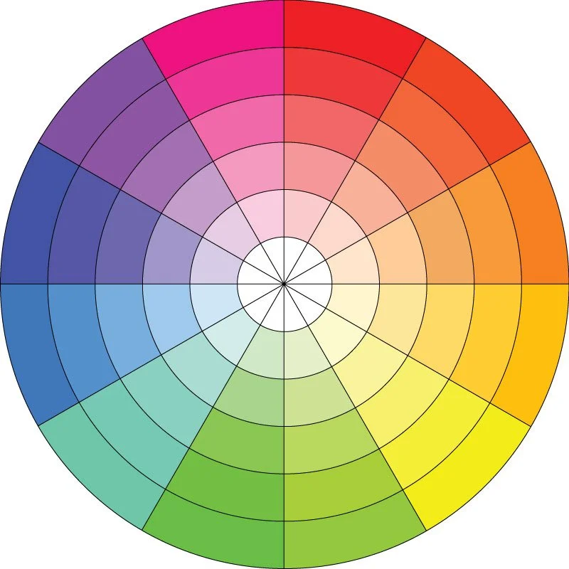
The color wheel can be a useful tool in choosing colors. It’s not for everyone, but like I said above, use it as a starting point if you’re feeling stuck. Download this color wheel here.
There are a few important words that help us understand color: hue and value. HUE is simply different colors. Pink, blue, green. VALUE is the different darkness or lightness, or shade of the color. In the color wheel above, each slice of color goes from a very light value in the center of the circle to a darker value on the outside of the circle. This is something you really want to pay attention to in knitting! Keep reading for more tips on how to use value to make your color combinations sing. For the purposes of this blog post (and trying to keep this simple and not daunting) we won’t get into SATURATION. Just know that it is how vivid a color is (think adding any of the colors above with gray and you’ve got a different saturation of that color.)
Like I said, this is a jumping off point if you’re feeling stuck, not a whole course in color theory. To keep it simple, let’s break it down into clear steps.
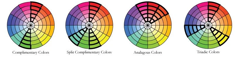
Step 1: Choose a Color Harmony. These are a few of the “color harmonies” or ways to use the color wheel to choose color combinations. These are by no way all of them, but these are a good place to start. Complimentary colors are exactly opposite from each other on the color wheel. So green and red (Christmas colors!), Yellow and purple, Turquoise and orange to name a few. These color combinations can be jarring sometimes, but play with them to see if you can make them work for you. Split complimentary softens complimentary colors just a bit by using the two colors flanking one of the complimentary colors - so instead of red and green, the combination becomes red, turquoise and chartreuse. Analogous is a safe bet - just choose colors that are next to each other on the color wheel. Triadic colors form a triangle on the color wheel.
If you want a place to play around with these harmonies, you can find interactive paper color wheels at quilting stores or online, and there are LOTS of free apps that will do this for you too. Download one of the free apps that will help you come up with endless color combinations. But don’t stop at color combination! Think about the values you choose within these color combinations…
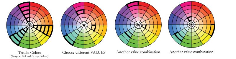
Step 2: Choose different values within that color harmony. Now, let’s say that I choose a triadic color combination. (The pink/turquoise/orange yellow is one I choose a lot, so I know I like it.) The thing about knitting, and especially color work, is that it benefits from contrast in value (lights and darks). If I chose the darkest of all three colors, my color work would look muddy and not show up very well. To avoid this, I usually choose different values of each color, or at least make sure there is some variety in the values. (There are lots of beautiful examples of low contrast color work, and that is definitely something that is fun to play with once you understand how it all plays together. If you’re looking for a starting point though, choose a variety of value for some contrast.)
Tip: It can’t hurt to add in some white or a very dark color! I almost always add a white or a very light neutral when working in color work because it helps my colors pop!

Step 3: Use your camera app to help you see the values of the colors you are looking at. This tool is invaluable! The world of color is huge and nuanced, and there is so much to learn. It’s okay if you can’t really tell if the values are different or similar - there are simple tools to help. (If you have a phone with a camera app, you’ve already got it.) To check whether or not your colors have different values, take a picture of your yarns. Use the filter on your camera to make the photo black and white. If your yarn colors appear different in black and white, you’ve got different values. If they don’t, your color work is going to look a little muddy.
Tip: Colors appear differently in stripes, color blocks or colorwork. You may be able to get away with less contrast in say, color blocking or stripes than in colorwork. That said, I still find that I like at least a little bit of value (light/dark) contrast between colors when working in stripes!

An example in action: Like I mentioned above, I know I like the pink/turquoise/yellow orange color combination. It’s one I tend to choose a lot in my wardrobe and the sweater pictured above is a favorite and often worn sweater of mine. This sweater above is an example of that triadic color combination with a white-ish thrown in. Looked at under the black and white camera filter you can see some lights and darks. You’ll see that the pink and turquoise show up the same with the b&w filter - this shows us how they are similar in value! Though those two colors are similar, I still have a bit of contrast in value by including the yellow and white. This makes my stripes pop more than they would with the pink and turquoise alone.
You might be noticing that this sweater above loosely follows the color harmony and value idea I just explained. (The yellow is maybe more yellow than yellow orange, and as we’ve just discussed, the pink and turquoise are very close, if not identical in value.) But don’t overthink it! Use this as a starting point to play with color, don’t be ruled by it! Artists make out of the box choices all the time, and these are ideas not rules. Don’t be afraid to just play and experiment! You’ll learn more about color combinations you like and don’t like by exploring and trying new things.
If you’re looking for a low-stakes place to play with color, I developed the Color Theory Cowl just for that. It has sections of stripes and color work so that you can scoop up an armful of colors and explore different ways to combine them. Find the pattern on Ravelry HERE. I’ve been thinking on a smaller scale finger less mitt that would give you an even lower stakes place to play with color. Keep your eyes tuned!